

Client
Lemon
Year
2022
Sides
Branding
Design
Strategy
Industry
Crypto
When we started working with Lemon, we discovered a typical problem of new categories saturated with messages: all brands looked alike and communicated in the same tone. To stand out and take over the market, we decided to do something completely groundbreaking, not only aesthetically but also in terms of the tone of communication.

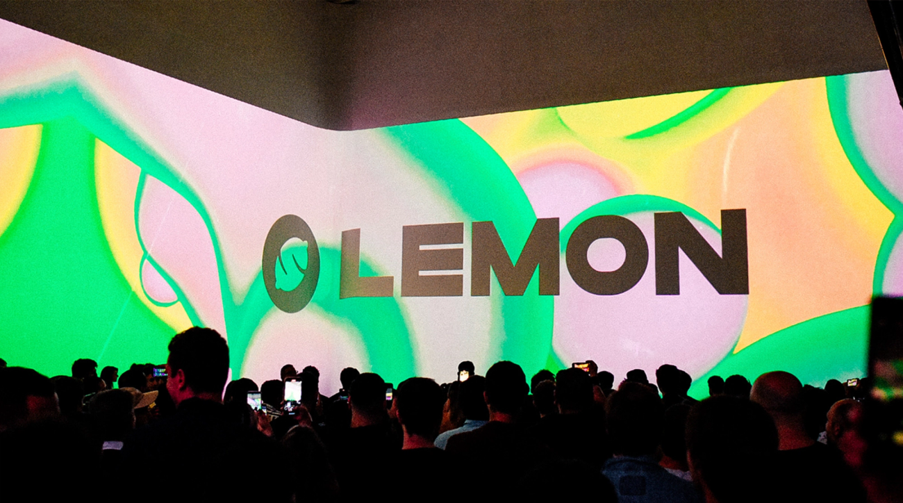
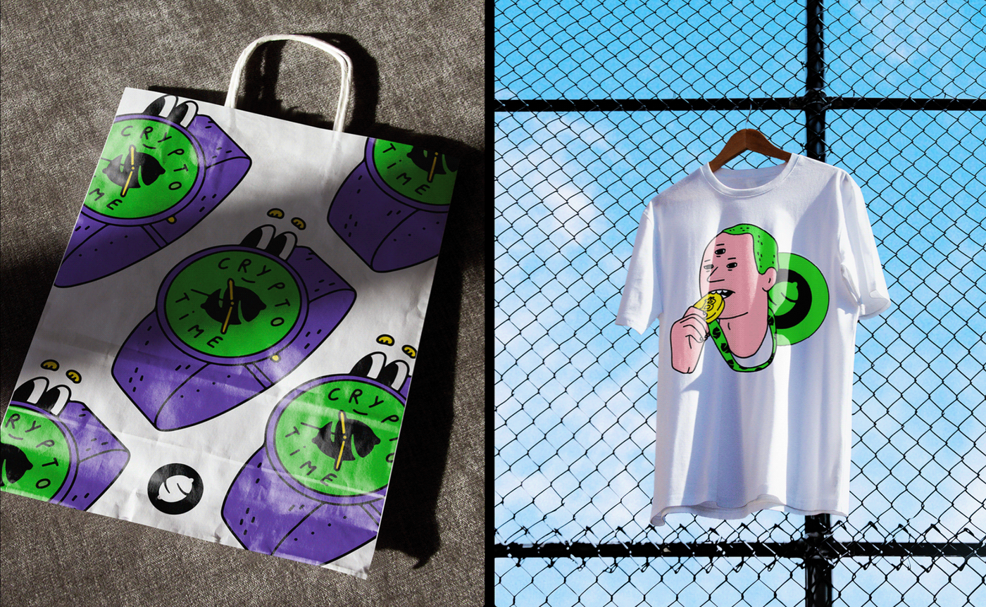
Lemon's new identity is a celebration of an open, lively and dynamic personality. Through different visual languages, we pay tribute to our way of seeing life: unabashed, cool, and ready to embrace the future, a very crypto friendly future!


Liquid concept
We faced a more pop version of the brand where colors are the protagonists, in charge of generating emotions and sensations to the viewers. The common thread of the brand is now "liquid".
We turned Lemon into a brand loved by its users and admired by its competitors.

The app was on several occasions the most downloaded in the country, beating monsters such as Tik Tok, IG or Whatsapp.


related projects